deviant art

Deviant Login Shop  Join deviantART for FREE Take the Tour
[x]
Shop Similar Prints
This Print Not Available
Download Image
JPG, 824×1000
more ▶

More from *Amarynceus

Featured in Groups:

Details

July 11, 2006
168 KB
824×1000
Link
Thumb

Statistics

Comments: 13
Favourites: 1 [who?]

Views: 731 (0 today)
Downloads: 37 (0 today)
[x]
:iconamarynceus:
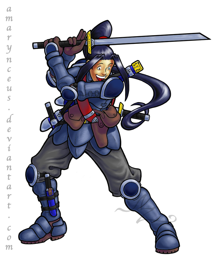
Yay, I finally finished something in Painter! :D

okay, okay, so it's marked as a WIP, it's not actually finished -- I've still got some tweaking to do, it needs a background, I haven't bothered to put in a secondary source, blah blah. Still. I've trashed basically everything I've done in Painter so far because, well, I'm still learning and producing a lot of 100% Grade-A Crapola.

The colouring only took an afternoon, but then I decided to tweak the lineart and ended up basically re-edging every single line to smooth it all out. Not sure if that was wise or not... :paranoid:

So, hit me with what you've got, eh?

Painter IX.5, Wacom Intuos.

(c) Avatar Z Brown

edit -- oh, don't bother mentioning the shadow errors on the left arm shoulder guard and hand guard, or the lack of dark tone and highlight on the goldish bits, somehow I just totally spaced on those. :(

dumb, dumb, dumb, those are some seriously rookie mistakes there...
Add a Comment:
 

The Artist has requested Critique on this Artwork

Please sign up or login to post a critique.

:iconkamoostoos:
good job man, are you planing on painting your usual stuff? might turn out really well!
Reply
:iconamarynceus:
*Amarynceus Jul 18, 2006   General Artist
I'm going through some of my older stuff and colouring it and such, yeah. Most of it has too much crosshatching to take colour really well, but some if it is suitable.
Reply
:iconreaper0collossus:
~Reaper0collossus Jul 16, 2006  Professional General Artist
well it still looks tottaly cool
Reply
:iconstaboteur:
Mm, yeah. Basically, the metal he's wearing (He IS wearing platelike armour, correct?) isn't textured correctly. If texture is the right word, that is. It looks mildly unfinished moreso in the sense of an unsanded wood than an incomplete... something. The light reflecting off it gets diluted quite a bit, the way you've got it set up now, and in my opinion needs to be sharper and (as you mentioned) more contrasted.

And I love it how the pants are basically perfect.
Hmm, looking at it again, you basically shaded the "metal" parts as you did the pants. Stepping up the contrast between the colours for the metals should help that. I'm a pixel artist, so I can't really edit it for ye, but I SHALL be resizing the hell out of your lines and giving colouring them a go. Sorry, yes, I'll be mutilating their original glory, but I'll TRY not to butcher them too badly =P

I 'member reading in the ':Slash: lines'... thing... that this was a character taken from a story... or something? It kind of null-and-voids the following, but neh. For being named Slash and wielding a sword, he looks rather a caring and happy person. There's no menace in his face or eyes, and I have a hard time feeling as if he'd be willing to cleave his sword through anything but apples. And why is he looking down at such an angle?

Just lookin' at your stuff teaches me lots. Thanks for continuing to make art, man.
Reply
:iconamarynceus:
*Amarynceus Jul 12, 2006   General Artist
Small point: Erin's definitely a woman. :lol: No worries, though, I've gotten quite used to many of my female characters being mistaken for males since, oh, forever basically. And the title is just a small joke that makes absolutely no sense given that the other half of the picture isn't shown at all..... XD

Anyway, your points are quite valid. I could make excuses like the fact that the armour's coated to protect against the saline air and suchlike, but the fact is it doesn't look metallic enough, and oftentimes representation is a more important figure than actual physical fact.

Oh, and the fact that she's looking down is also tied to the missing part of the picture.... sheesh, I should really finish it so it makes more sense... :paranoid:

Glad the trousers look good, I wasn't sure of them at all as I totally BS'd the folds with little regard to realism.

I'll definitely be keeping everyone's comments in mind when I finish this pic.

Oh, and do whatever you want to the lines, I don't mind. :)
Reply
:iconmesko:
~Mesko Jul 12, 2006  Hobbyist General Artist
Ah, so this was the scheme you thought of. ^^
Reply
:iconnightmareprince:
excelent ^-^ the colouringis marvelous I mean the armour looks heavy, the clothing looks softer it really works. My one thing i'd have to say is the sword looks flat and a bit to straight. I know the japanese Katana hasa curve to it, but I don't mean that way, it's the fact thehighlights don't make it standout as much and it's rather 2D looking in a picture that's got a 3D quality. otherwise awesome
Reply
:iconamarynceus:
*Amarynceus Jul 12, 2006   General Artist
Thanks.

Yeah, I sort of didn't finish the sword either. ^^; It looks rather like a cut-out right now, doesn't it :lol:
Reply
:iconnightmareprince:
:giggle: aslong as you knew the sword was a bit flat hehehe that don't matter and dont dis them cut outs some of them have sharp edges! :D
Reply
:iconskulljammer:
~skulljammer Jul 11, 2006  Professional Artist
I've never used painter but I think all it needs is some lighting effects over what you have now with some hard cuts, Its looking great man!!!
Reply
Add a Comment: